Two Answers to One Request: When Choice Beats a Single Answer
We break down when two answers to one prompt help users choose tone, format, or action faster, and when that approach only creates confusion.
Why one answer is often not enough
One answer seems convenient, but it almost always hides a choice the model has already made for the user. It decides on its own what matters most: speed, completeness, caution, a formal tone, or direct action. If the prompt is short, there are even more guesses. The user sees a smooth piece of text, but not the branching decisions left behind the scenes.
The problem is that LLMs sound confident too easily. Even experienced teams sometimes take that tone as a sign of quality. A calm phrasing creates the feeling that the best path has already been found, even though the model may simply have picked the most likely template. For a request like "how should I reply to a customer complaining about a delay," one version will be softer and keep the conversation going, while another will be more blunt but safer for lawyers. Both can be reasonable. One answer just hides that choice.
This becomes especially visible where mistakes are expensive. In a bank, a clinic, or SaaS support, the first answer can easily frame the whole conversation the wrong way: the wrong risk level, the wrong amount of detail, the wrong next step. After that, the user is refining the question inside someone else's logic instead of starting over. One bad phrasing then pulls the next one with it.
That is why two answers to one request are often more honest than one "correct" answer. The user immediately sees that there is at least one other reasonable path: shorter or more detailed, more cautious or more direct, faster or more precise. The difference is especially clear when a team compares answers from different models and notices that they interpret the same prompt differently. That is not always an error. Sometimes it simply shows the ambiguity in the question itself.
One option is fine when the task is simple and a mistake costs almost nothing. In all other cases, a single confident answer often closes the discussion too early.
When choice really helps
One answer works well when the task boils down to a fact: translate a phrase, name a date, find a number. But in real work, the goal is usually broader. The user does not always know what they need right now - a fast draft, a detailed explanation, or a more cautious wording.
In those cases, two answers work better than one confident text. The model does not try to guess the person's priority blindly. Instead, it shows two valid paths. The choice takes one extra click, but then there is less rework.
The most common case is the trade-off between speed and accuracy. An employee may need a customer email draft in 10 seconds. Then they will choose the short and direct version. If the same email later goes to legal or a partner bank, that same person will probably prefer a more careful version with caveats and precise wording.
The same logic applies to the difference between a short and a detailed answer. A brief format is good in chat, in a ticket card, and in a mobile interface where decisions are made on the go. A detailed one helps when the text will be forwarded, approved, or used as the basis for a document.
Sometimes the issue is not facts at all, but tone. The same meaning can be delivered neutrally and professionally, gently and with explanation, or a bit more firmly when a clear call to action is needed. This is especially useful in services where AI writes customer messages, candidate replies, internal notes, or support copy. One tone can sound too dry, another too casual. If you show both, it is easier to choose the right one.
Choice also matters where mistakes are costly. If an error could lead to a complaint, extra costs, or a policy violation, it is better to show two safe options than one questionable one. In these tasks, the cost of one extra click is lower than the cost of a wrong answer.
The rule is simple: if you can honestly answer a prompt in two ways and there is a clear trade-off between them, choice is useful. If one option is better in every situation, the second one is just noise.
Which answer pairs work best
Pairs only work when the difference is obvious right away. The user should understand in a couple of seconds why the choice exists. If both texts are almost the same, the second answer just clutters the screen.
Pairs by form and tone
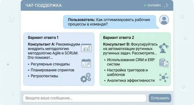
The clearest pair is a short answer and a detailed one. The short version is for when the person is in a hurry and wants to solve the issue in a minute. The detailed one fits when the topic is new, there is a risk of error, or the logic needs explaining. For example, an employee asks how to handle a return. The first answer gives three steps. The second explains which documents to check and where people usually make mistakes.
A "cautious" and "direct" pair also works well. A cautious answer is useful where you should not sound too certain: law, medicine, finance, or HR. A direct answer is better when the person expects a clear action. In bank support, one version might say: "Check the latest transactions and visit a branch if the charge is unfamiliar." The other would be shorter: "First block the card, then dispute the payment." Both are useful, but for different levels of risk.
Pairs by cost and time
Sometimes the difference is not style, but the cost of the answer. One version can come from a faster, cheaper model, while the other comes from a stronger model that handles context better and loses fewer details. This is useful in products where both budget and quality matter.
Another good pair is "do it now" and "fix it properly." The first answer helps people avoid getting stuck in the moment. The second reminds them about the proper solution, which takes time. If a customer writes, "Our chat replies are too slow," the first version might suggest shortening replies and removing extra context. The second might say to collect logs, measure latency step by step, and then change the route between models.
A good pair is always built around one clear difference: volume, tone, cost, or time horizon. If that difference cannot be explained in one short sentence, it is better not to show the pair.
How to ask the model for two versions
If the prompt is vague, the model will almost always write two very similar answers. To make choice actually work, start with one concrete task and no extra conditions. Do not mix tone, channel, length, audience, and message goal in the same request.
A good start sounds simple: "Reply to the customer asking where their order is." A bad one overloads the model: "Reply to the customer in a friendly, businesslike, brief, selling style for chat and email at the same time." In the second case, the model will still decide what matters most, and the point of having a choice disappears.
Then define the difference along just one dimension. Usually tone, level of detail, or degree of certainty is enough. For example: version A is short and neutral, version B is warmer and a little more detailed. If you change several things at once, the user will not understand what they like better.
A good template does a few simple things: it describes one task, sets one difference between A and B, limits the length of each answer, asks for a short label explaining the difference, and prevents version B from repeating version A's wording.
You can already use such a prompt in a product:
Дай 2 варианта ответа клиенту, который спрашивает о задержке доставки.
Вариант A - короткий и деловой.
Вариант B - более мягкий и подробный.
Каждый вариант - до 60 слов.
После каждого варианта добавь одну строку: "Отличие: ..."
Если вариант B слишком похож на вариант A, перепиши вариант B.
A short note about the difference saves time. The user immediately sees what kind of answer they are looking at: dry, calm, or more human. It also helps the team. Later, it is easier to review logs and understand which pairs people choose more often.
Length limits matter too. Without them, the model can easily make one answer 30 words and the other 180, and the comparison breaks. For support chat, 40-80 words per version is usually enough.
The last step many people skip is checking for repetition. Ask the model to compare the second version with the first and rewrite it if the difference is too weak. Otherwise the user will see a fake choice, and that is more annoying than one solid answer.
Example: e-commerce support chat
A customer writes: "Where is my order?" At first glance it seems simple, but there are often different goals behind the question. One customer wants to see the status quickly and calm down. Another is already upset about the delay and wants to know how to get a refund or talk to a human.
In that situation, two answers are more useful than one average reply. One handles the normal case, while the other helps people for whom a plain status is no longer enough.
The first version can be short and calm: the order has been handed to delivery, it is now in the sorting center, and the expected arrival time is tomorrow after 6:00 PM. That is good when the system shows a normal status and the delay is small. The person gets the fact and the time in a couple of seconds.
The second version is needed when the customer already has a reason to be upset. For example, the order is three days late, it is a gift, or the person is asking again. Then it helps to show an answer with action: they can request a refund, cancel before delivery, or switch to an agent for a call. That changes the conversation. The chat does not argue with the customer's frustration - it immediately offers a way out.
The interface matters too. It is better not to hide the second answer under a "more" button. It is simpler to show two clear blocks side by side or one under the other: "Check status and delivery time" and "Get a refund or contact an agent." A calm customer clicks the first option and does not read anything extra. An unhappy one goes straight to the second and does not send three more messages.
If the store knows the package is stuck with the courier and the model sees that order status in the data, it should not give one neutral answer to everyone. It is much more honest to show one path for people willing to wait and another for people who need a quick exit. That is also convenient for support: fewer empty back-and-forth messages, fewer manual clarifications, fewer angry repeat contacts.
This approach works especially well when the product is time-sensitive, like a birthday gift or a device needed "for today." In those cases, people do not need one "smart" answer - they need a clear choice.
Where two answers only get in the way
Two answers are not always useful. Sometimes choice does not help - it just slows things down. The simpler the task and the higher the cost of a mistake, the less value there is in alternatives.
Urgent situations call for one clear step. If someone writes, "My card was stolen," "I was charged twice," or "I cannot log into my work account," they do not need a mini-survey of two reply versions. They need a short path: what to do right now, in what order, and where to tap.
It is bad when the bot writes, "You can either wait 15 minutes or contact support right away." In a stressful moment, that choice only overwhelms people. It is better to give the main action and keep the backup option for when the first one fails.
Choice is also risky in legal and regulatory text. If the service shows consent for data processing, a credit application rejection, or a message about data retention rules, free-form model alternatives are better left out. Here you need approved text, not two almost suitable versions. Even if the team compares answers from different models through AI Router, these blocks are safer in templates.
A simple factual answer rarely benefits from choice. When a user asks for the delivery time, the fee, or the order status, the system should state one fact. Otherwise the person starts guessing which answer is correct.
Another issue is nearly identical answers. This is a common design mistake: the model gives two versions that differ by a couple of words. The user spends time reading both texts and gains nothing new. Frustration appears very quickly.
There is a simple test. If the person still has to guess which answer is "right," the second version was unnecessary. In those cases, one accurate answer is more honest and more useful.
Common mistakes
The most common mistake starts in the prompt. The team asks the model for two versions but does not define what should differ. Then the model changes everything at once: tone, length, level of detail, and even the actual conclusion. The user no longer sees a choice of form, but two different positions.
The opposite extreme happens too. Both answers repeat the same idea in different words. On screen, that looks like a choice, but in reality the person loses an extra 10-15 seconds and gets no new value. If you show two answers, the difference should matter in substance, not just in style.
Honest comparison also often breaks. The team deliberately makes the second version worse: drier, shorter, or less precise, so the first one wins more often. That gives a nice metric and a bad product. The user quickly notices the rigged contrast and stops trusting both answers.
The interface mistake is even simpler. People are shown two versions, but no one explains why the choice exists at all. In e-commerce support, it shows up immediately: the operator gets a "short" and a "detailed" answer, but no one says when to use which. A day later everyone is choosing at random, and the team thinks the test is going fine.
Before launch, it helps to check four things. First, keep only one difference between the answers. Second, remove pairs where the meaning is almost identical. Third, do not make one version obviously worse. And finally, save the user's choice in logs.
That last point is often forgotten. If the logs do not show which option the person picked, the debate is blind. It is even worse when you only see the click, but do not know what happened next: did the user send the text without edits, rewrite half the answer, or request a third version?
A good setup is very simple. One answer can be short and direct, the other more detailed, but both should honestly solve the same task. If the difference spreads into the meaning, the approach only adds noise.
Pre-launch check
You do not need a long audit before releasing this kind of feature. A short check is enough: can people understand the difference between the two versions immediately, will they get confused at the next step, and can the team see what happens after the pair is shown?
If it takes 10-15 seconds to understand how the options differ, the idea is already working poorly. For a chat screen, that is too long. The difference should be readable almost instantly. "Short answer" and "Answer with explanation" are clear right away. "Option A" and "Option B" do not say anything.
Before launch, ask yourself a few direct questions. Can the difference between the answers be understood in three seconds without reading tiny details? Do the labels honestly describe the difference, instead of nudging people toward one option? Does each answer lead to a safe next step: clarify data, confirm an action, open instructions, or contact an agent? Can the team see in the metrics what the person chose, what they rejected, and after which version they asked the same question again?
Labels matter more than they seem. If one option is called "Recommended" and the other "Alternative," you are already nudging the user toward one path. It is better to write directly: "Quick answer" and "Detailed answer," or "Soft wording" and "Direct text." The user should understand the difference, not look for a hidden signal.
The next step also has to be checked separately. Two answers should not lead to a dead end. If one version sounds confident but the person still does not know what to do next, that answer creates an extra loop in the conversation. A good pair leaves a simple action choice.
What to watch after launch
Numbers quickly show whether this is useful. Do not look only at clicks on the options. Three signals matter just as much: how many people do not choose either answer, how many ask the same question again right away, and how many reach the needed action without operator help.
If almost nobody picks one option, do not rush to fix it with new labels. First check whether the second answer is needed at all. Sometimes one clear answer is more honest and more useful than choice for the sake of choice.
What to do next
Do not start with every scenario at once. Begin with five common requests where people really do hesitate between two normal options. Usually these are replies with a different tone, different length, or different level of directness. That is already enough to see whether the two-answer format is useful in a real product.
Then run each request in two versions. The easiest way is to compare either two models or the same model with two prompts. For example, in the first version you ask for a short, practical reply, and in the second for a softer answer with an explanation and a next step for the user.
Do not look only at what the team likes. It is much more useful to measure three things: what users choose more often, how much each version costs, and how much response time increases. Sometimes a more expensive pair changes almost nothing, and then one answer is better. Other times the second version adds 300-500 milliseconds but clearly reduces the number of follow-up messages. That trade-off is often worth it.
If you already have product traffic, run a small test on part of your requests. If traffic is still low, give these scenarios to support, an editor, or an account manager and collect quick manual feedback. Even 20-30 comparisons are usually enough to show where choice helps and where it just adds clutter.
It is handy when you do not need to rewrite the integration. If the team uses AI Router, you can send pairs of models through one OpenAI-compatible endpoint and change only the routing, without touching the SDK, code, or prompts. That cuts down on extra work at the start and makes it faster to compare results, price, and latency.
If the project has data storage requirements in Kazakhstan, check that immediately, not after a successful demo. It is important to understand in advance where the data lives, what audit logs you will get, how PII is masked, and how key-level limits will work. Otherwise a nice test case will have to be redesigned in production.
A good result from this kind of sprint is very simple: you have five requests, two versions for each, numbers for choice, cost, and latency, and a clear decision about where to keep one answer and where to offer a choice.
Frequently asked questions
When is it worth showing two answers at all?
Show two answers when the prompt has a real trade-off: shorter or more detailed, softer or more direct, faster or more accurate. This format works well in support, customer emails, and internal messages where one style does not fit everyone.
When does the second option only get in the way?
Keep only one answer when the person needs one fact or one urgent action. If the user is asking for a status, a fee, or to block a card right away, choice only slows them down and breaks their flow.
Which answer pairs are usually the most useful?
The best pairs usually have one clear difference. For example, a short and a detailed answer, a soft and a direct tone, a quick draft and a more accurate version, or a do-it-now step and a system fix.
How should I ask the model for two versions?
First give the model one task without extra conditions. Then define one difference between A and B, limit the length, and ask it not to repeat the same wording. If you change tone, channel, length, and goal all at once, the answers will blur together or drift apart.
Why are two answers often better than one in support chat?
Because one average text rarely works for both a calm customer and an annoyed one. One version can quickly handle the normal question, while the other can immediately offer a refund, an agent, or another way out if the delay is already frustrating the person.
How do I know the options are too similar?
Look at the meaning, not just individual words. If the user reads both texts and sees no new value, the choice is fake. In that case, rewrite the second version with a different tone, length, or next step.
Should I label the options in the interface?
Yes, a short label helps a lot. People understand the difference between "Quick answer" and "Answer with explanation" much faster than between "Option A" and "Option B." The label should state the difference directly, not push toward one choice.
What should I watch in the metrics after launch?
Track more than clicks. Look at which option people choose more often, how many choose nothing, how often they ask the same question again, and whether operator contact drops. It also helps to keep cost and latency beside each option.
How can I compare two models without reworking the integration?
If you already have an OpenAI-compatible integration, it is convenient to change only the request routing and compare model pairs without touching the SDK or prompts. In AI Router, you can send traffic through one endpoint and watch the result, cost, and latency.
What should I check for data and risk before release?
Check right away where data is stored, how the service masks PII, which audit logs you get, and where the key-level limits are. If the project operates in Kazakhstan and has data-localization requirements, it is better to close those questions before testing, not after a successful demo.