Provider Health Scoring by Your Own Metrics for LLMs
Provider health scoring helps you see real outages, latency spikes, and quality drops on your own requests, not on a generic status page.
Why the status page does not show your reality
A status page almost always shows the average temperature in the hospital. It answers the question "is there a major outage overall," not the question "how are my requests doing right now." That is not enough to assess provider health.
A provider can keep a green status while your scenario is already breaking. That happens all the time: you have one model, one prompt style, one region, your own limits, and your own response length. The provider mixes all of that into one overall picture, and your outage gets lost in it.
Most often, it is not the provider as a whole that degrades, but one specific thing: a particular model, one route, one data center, long responses, streaming, or requests with tool calling. On a general status page, none of that may show up at all because the rest of the traffic is fine.
If the team works through a single OpenAI-compatible gateway like AI Router, the difference becomes even clearer. From the outside, you have one endpoint, but inside the request may go to different providers and models. A green overall status does not mean the combination you need is healthy right now.
There is another trap too: retries. They often hide failures and create a false sense of stability. Formally, the request succeeded, but only on the second or third try. The user sees the delay, the service spends more tokens and time, and the internal success stats look better than reality.
That is why teams often say, "the uptime is high," even though users are already complaining about hangs and empty replies. If the first attempt failed and the second one went through after 8 seconds, that is not normal operation. That is hidden degradation.
A status page is useful as background. It helps you understand whether the provider has a major incident. But for a real assessment, you need your own picture: what is happening with your model, in your region, at your request size, and without the cosmetic effect of retries.
Provider health is measured on your side. Not by the banner "all systems operational," but by how the service answers your production workload right now.
What counts as provider health
A healthy provider is one that consistently delivers a useful result for your task. A 200 response code by itself guarantees nothing. If the model returned an empty string, broken JSON, or text that is twice as short as expected, the business task is not done.
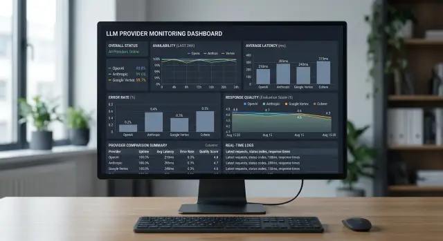
That is why it is better to measure health across several dimensions at once: request availability, useful response quality, time to first token, full response time, and the cost of a successful response.
Availability and quality should be separated. LLM API availability answers one simple question: did the provider accept the request and return a response without a technical error. Response quality answers a different question: can the output be used without manual fixes and a second call.
In practice, the difference shows up quickly. Say a support bot asks the model to return JSON with the ticket category and a short reply for the customer. The provider may be "available" for most of the day, but if 7% of responses arrive with broken format and another 3% are empty, that is already a bad day for the product.
It also helps to split latency into two metrics. Time to first token shows how quickly the system starts answering the user. Full response time shows how long the entire operation takes until the final result. For chat, the first metric is often more important. For batch jobs, the second matters more.
It is better to check format and length explicitly. See whether the response matches your schema, whether it contains enough text for the task, and whether it gets cut off early. Count empty responses separately. They are almost invisible on a general status page, but they hurt the real picture a lot.
Cost is also worth keeping next to the other metrics instead of in a separate report. If the same successful response is 30% cheaper with another provider, that affects route health almost as much as rising latency. A good score shows balance: the response arrived, arrived on time, passed validation, and cost a reasonable amount.
Which metrics to collect on your side
Counting only HTTP 200 is not enough. For provider health scoring, you need metrics that show whether the user got a working response, how fast it happened, and whether that response can be trusted.
Start with response codes. Keep the share of 2xx, 4xx, 5xx, and 429 separate. That immediately shows where the problem is: your request is broken, the provider is failing, or you have hit the limits. One overall success rate hides too much.
Count network failures separately. A timeout, a connection drop, and a canceled request are not the same thing. A timeout often points to overload or too slow generation. A connection drop is more often related to the network or proxy. A cancel is usually made by the client, and it should not be mixed with provider errors, or you will understate LLM API availability.
For latency, look at P50 and P95 rather than the average in two places: time to first token and time to full response. The first metric affects how fast chat and copilots feel. The second matters for long generations, summarization, and JSON exports. The average here is misleading: one very slow response can ruin the day, and the user will notice the tail at P95.
Response format quality also needs to be measured numerically. Track the share of broken JSON, empty responses, and truncated responses where the stream ended too early. If the model often returns 200 but breaks the schema, that is almost the same as a failure for the product. Especially in integrations where the next service expects strict JSON and gets only half an object.
Another metric that is often forgotten is the share of refusals where a refusal was not expected. If you send a normal invoice classification request and the model says it cannot help, that is a defect in the route, safety settings, or the provider itself. For response quality, such refusals should be counted separately from technical errors.
For the first dashboard, this set is usually enough:
- response codes by group and 429 separately
- timeouts, drops, cancellations
- P50 and P95 to first token
- P50 and P95 to full response
- broken JSON, empty, truncated, and unexpected refusals
If a metric does not help you make a routing decision, it probably does not belong on the first dashboard.
How to slice the data without confusion
One single overall number almost always lies. If you put all requests into one graph, you will not know who caused the failure: the provider, the model, the network, or your scenario. For provider health scoring, you need narrow slices, otherwise a good average result will hide the real problem.
First, separate the provider and the model. The same provider may keep high uptime overall but degrade only on one model. The opposite also happens: one model works reliably with two providers, but breaks with the third on your route. If you use a gateway like AI Router, the reports should still store both the provider and the exact model as separate fields, even if from the outside you have one OpenAI-compatible endpoint.
The task type also changes the picture. Chat, text extraction, and classification stress the model in different ways. For chat, the team often tolerates an extra 500-700 ms, but for classification that is already a poor result. If you mix such requests, latency monitoring becomes noisy and response quality will look worse or better than it really is.
At minimum, separate these five things right away: provider and model, task type, region and network exit path, production traffic and canary checks, short and long requests.
Region and network are a common source of mistakes. A request from Almaty through one path may run smoothly, while the same call from Astana through another path shows spikes in time and more 5xx errors. That is not an abstract provider problem, but your real path to it. These groups should be compared separately.
Canary checks should also not be mixed with production. A synthetic request is stable: the same prompt, the same response size, the same frequency. Production traffic behaves differently. Users write longer messages, ask for tables, and attach large blocks of text. If you combine that all together, LLM API availability will look better than it is for real users.
Another source of noise is request length. A short 50-token prompt and a long 8,000-token document should not sit in the same bucket. Otherwise, API provider errors, timeouts, and latency will blend together with the normal effect of heavy load.
A good slice answers a simple question: for whom, on which model, for which task, and on which route did the drop start. Then the decision becomes obvious.
How to calculate the final score
The final score is for routing, not for a pretty dashboard. If it is too complex, the team quickly stops trusting it. If it is too simple, it misses failures. In practice, 4-6 metrics are enough if they directly influence provider selection for your workload.
Common signals are: availability based on your successful requests, P95 or P99 latency, the share of timeouts, the share of API provider errors, the share of broken response format, and a quality score on a control set of requests.
Each metric is best converted to a single scale from 0 to 100. Otherwise, 1% timeouts, 4 seconds of latency, and 7% broken JSON cannot be added together honestly. Normalization should be set not "by the market," but by your own thresholds. For one product, a P95 of 3 seconds is acceptable; for another, that is already a failure.
A simple version looks like this:
score = 0.30 * availability + 0.20 * latency + 0.20 * quality + 0.15 * api_errors + 0.10 * timeouts + 0.05 * format
But the weights should not be copied from a template. For chat support, a small increase in latency is often tolerable, but a timeout or broken JSON breaks the scenario immediately. For background document processing, latency matters less, while response quality and format stability matter more. Good scoring is always tied to the task, not to an abstract "average" model.
The penalties should also differ. A rise in P95 from 1.8 to 2.2 seconds is usually not a reason to move traffic away immediately. But a jump in timeouts from 0.2% to 1.5% is already dangerous. The same goes for broken format. If your parser cannot read the response, that failure should be penalized more heavily than an extra 300-500 ms.
Do not calculate the score on a one-minute window. On a short window, there is too much noise, especially with low traffic. It is better to use a rolling 15-30 minute window for routing and keep a longer window of several hours nearby to check the trend. Another useful safeguard is a minimum sample size. If there were 8 requests, that score is too early to treat as decisive.
And keep not only the overall score, but also the reasons it dropped. A note like "score 61: timeouts -18, format -14, quality -5" is more useful than a red indicator. The team immediately understands what broke and does not waste an hour guessing.
Example on live traffic
Imagine customer support where the model must return strict JSON: ticket category, priority, a short reply, and whether a human is needed. On tests, everything looks smooth. On live traffic, the picture changes quickly.
During the day, the team sends about 200 requests per minute. Provider A hardly returns any HTTP errors, and by the general status page everything looks fine. But time to first token rises from 0.9 to 1.8 seconds. For support chat, that is already noticeable: the operator waits longer, the customer sees a pause, and some requests get retried.
If you look only at LLM API availability, provider A seems normal. If you look at your own metrics, you see something else: the service is alive, but it works worse for your scenario. The JSON arrives, but slowly. For ticket classification, that is still tolerable, but for a live conversation it is not.
At night, traffic moves to provider B. Its time to first token is better, but another problem grows: responses are more often cut off in the middle. The HTTP code stays 200, the status page is green too, but the share of completed responses drops, for example, from 98% to 91%. This is visible in the logs right away: the closing brace in the JSON never arrived, the priority field is empty, the parser breaks.
In such a situation, health scoring is more useful than any general panel. It takes into account not one signal, but several at once: the share of successful responses, time to first token, the share of valid JSON, and the share of responses without truncation.
Suppose you give availability 40% weight, latency 25%, JSON validity 20%, and response completion 15%. During the day, provider A's score drops to 78 out of 100 because of latency, even though its own alert has not fired yet. At night, provider B falls to 72 because of stream truncation.
The system sees this before a person does and shifts traffic to the backup route. For the team, it looks simple: the same request, the same response format, but a different provider under the hood. If you work through a single gateway, it is easier to keep such switching in one routing policy than to duplicate it in every service.
On live traffic, it becomes especially clear why a green status guarantees nothing. The user does not feel the color on the dashboard, but the pause, the drop, and the broken JSON.
Where teams most often make mistakes
If the provider returned HTTP 200, that still does not mean the request went well. The model may have truncated the response, returned an empty string, broken the JSON, or answered too late for your scenario. For scoring, 200 is only proof of delivery, not of a normal result.
Another common mistake is hiding failures behind automatic retries. The client repeated the request three times, then moved traffic to the backup route, and the chart suddenly looks clean. That is sometimes useful for the user, but harmful for measurement. Keep two numbers: what happened on the first attempt and how it ended after retries. Otherwise, LLM API availability in reports will look better than in real operation.
An average number across all models almost always lies. One model keeps the format but answers slowly. Another is fast, but more often refuses or breaks the structure. If you mix everything into one metric, the meaning is lost. Look at the data separately at least by provider, model, region, and task type.
Teams often ruin the comparison themselves. They change the prompt, temperature, system instructions, or context size and then conclude that provider A is better than provider B. That is a different test. If you are comparing response quality, the input must stay the same across the entire comparison window.
A too-short observation window is also misleading. Five minutes after a release or ten requests from one customer do not show the full picture. One traffic spike, one long document, and latency monitoring is already drawing a false alarm. It is better to keep several windows at once: a short one for reaction, a daily one for trend, and a weekly one for recurring failures.
And finally, teams often forget about a fixed request set. Without it, quality starts being judged by eye, and that is a bad method. Take a set of typical tasks and run it regularly. For a bank, that might be extracting fields from an application form; for retail, classifying tickets and asking short questions against a knowledge base. That way you will see not only API provider errors, but also silent degradation, when the response is formally successful but less useful than before.
Checklist before launch
If you do not set up basic observability before launch, you will only see general noise: "something is slow," "errors went up somewhere." That is not enough for provider health scoring. You need signals that tell the team where the failure is, when it started, and whether traffic should be moved right away.
Before production traffic, check the minimum.
- One request_id should pass through the entire request path: client, your backend, router, model call, retries, and response.
- Each task needs its own set of canary requests. One universal prompt almost always lies.
- Alerts should watch not only the error rate, but also latency and response format.
There are three more checks that often save long nights of investigation.
- The dashboard should have slices by both model and provider.
- Retries and timeouts should be counted separately from first responses.
- The team should agree in advance on the route-switch threshold and the rules for moving traffic back.
This minimum quickly shows the difference between "the provider is down" and "the provider is alive, but no longer fits your task." These are different problems, and they are fixed in different ways.
If you use a single LLM gateway, make sure this data is collected in one layer rather than spread across several systems. When an incident is already happening, nobody wants to manually stitch logs, metrics, and traces together. A good launch is when the on-call person understands in a couple of minutes what broke and which route to enable.
What to do next
Start not with a big formula, but with 3-4 signals: successful response rate, P95 latency, timeouts, and the percentage of empty or broken responses. That is already enough to see where the provider behaves worse for your workload than the general status page promises.
Recalculate the metrics every 5-15 minutes. That pace gives you a live picture without rattling the team over a random spike in one minute. If traffic is low, it is better to widen the window a bit, otherwise noise will start to get in the way.
Do not hand decisions over to automation immediately. First, keep the scoring in shadow mode: the system calculates scores, writes them to the dashboard, and suggests a conclusion, while the team checks it against manual review. After a few days, it is usually clear where the formula was accurate and where it punished the provider for an unlucky prompt, a rare scenario, or a client-side failure.
Then add actions step by step:
- send a soft alert if the score drops below the threshold for several windows in a row
- move only part of the traffic to the backup route
- switch the full stream only on a clear and repeatable failure
- save the reason for the trigger next to the decision
- record which threshold gave the best result without unnecessary flapping
Once a week, it helps to review false positives separately from real incidents. It is boring work, but it pays off quickly. After such a review, the team often changes weights: lowers the penalty for one type of 429, raises the penalty for timeouts, or separates the rules for short and long requests. That is how the score starts reflecting real LLM API availability and response quality, rather than the average temperature across all cases at once.
If traffic goes through AI Router on airouter.kz, it is easier to collect such metrics in one place: you change the base_url to api.airouter.kz and keep working through an OpenAI-compatible endpoint, even if you are comparing several providers and models under the hood. That is handy when you need to evaluate routes by your own metrics, not by the status pages of different vendors.
A good result here looks simple: fewer alerts, fewer manual switches, and the drop is visible before users notice it. If the system catches a couple of real degradations in a week and makes almost no noise for no reason, you are on the right track.