AI Content Labeling in the Interface: Editor, CRM, Chat
Show how AI content labeling works in the interface and where to place the label in an editor, CRM, and chat so it helps instead of getting in the way.
Why people get confused without a label
Confusion starts where the interface stays silent about where the text came from. The user sees a paragraph, an answer, or a customer card and does not understand what they are looking at: a finished piece, a model draft, or a fragment that a person already edited.
Then people start guessing from indirect clues. If the text sounds too polished, they assume AI wrote it. If it has vivid details, they think it was written by a colleague. Those guesses almost always cause problems: a person either trusts too much or wastes time checking things again.
This is especially noticeable in an editor. The author opens the text and does not see where their draft ends and where generation begins. The editor then revises it blindly: it is unclear what needs stricter review and what has already been through human hands. In the end, one paragraph gets rewritten for no reason, and another is left with an error.
In CRM, the risk is different. A manager looks at a ready-made message to a client and hesitates to click "Send" because they are not sure where the text came from. If they mistake a raw model output for their own draft, the error goes out in seconds. If, on the other hand, they suspect AI in every template, work slows down: the manager rereads the same thing and still doubts it.
In chat, the problem is even sharper because every second counts. The operator needs to see immediately what has already been sent to the client, what the model suggested, and what is still waiting for confirmation. When everything looks the same, the interface makes them think not about the conversation, but about the status of each message.
Usually this leads to four simple consequences:
- text takes longer to check
- employees are afraid to send replies
- teams argue over who is responsible for the mistake
- trust in the AI feature drops within the first week
One label cannot solve every task. A small "AI" badge may work in chat, but in an editor it is not enough: there, people need clearer context. In CRM, on the other hand, a long banner gets in the way if the person is working through a dense task list. Labeling only works when it takes into account the location, the risk of error, and the user's next action.
What the label should tell you right away
A good label leaves no mysteries. The user looks at the screen for one or two seconds and understands three things: who created the first version, who changed the text afterward, and whether it is already safe to click "Send".
If that clarity is missing, people start guessing again. In an editor, they are afraid to publish a raw draft. In CRM, the manager cannot tell whether a colleague wrote the reply or the model assembled it. In chat, it is harder for the operator to respond confidently when the message status is hidden in a menu.
The source of the draft is best shown in plain text: "Draft created by AI" or "Draft created manually." An icon without a label rarely helps. People read it differently, while a short phrase clears things up immediately.
Next, you need a signal about edits. Here, the name and time matter, not a vague status like "updated." A phrase like "After AI, the text was edited by Aaliya, 14:20" says much more than a colored dot or an abstract badge.
It is also worth showing whether the text is ready to send. That should not be mixed up with the fact that it was generated. AI may have created the text, and a team member may have reviewed it, but that does not automatically mean it is ready to go. So a clear status is needed nearby: "Needs review", "Reviewed", or "Ready to send".
One more useful element is quick access to the history. If the user wants to understand what exactly changed after generation, they should be able to open it in one click. A compact "Edit history" button next to the label is almost always more convenient than a long expandable card.
In CRM, for example, an email might have one line: "Draft created by AI, reviewed by Nurlan, ready to send." Short, calm, and to the point.
How to show the label in an editor
In an editor, the label should help people read and edit the text, not get in the way. That is why it is better placed next to the block title, section name, or status line. If you put it over the paragraph, people start fighting the interface: selection gets interrupted, the text is covered, and the eye catches the badge instead of the meaning.
Usually a calm version is enough: block title and a short status like "Generated by AI" next to it. If needed, you can add the source. That is enough for the user to understand where the fragment came from and decide whether to treat it as a draft or review every line.
The buttons "Generate" and "Rewrite" should also stay close to the label. The source is best shown next to those actions or right after the command is executed. Then the connection is clear: which text the model created, which operation changed it, and where it came from.
After a manual edit, the status should change. If the editor rewrote half a paragraph, it is more honest to show "AI + editor" instead of leaving the old label as if nothing had happened. This greatly reduces internal disputes.
In long documents, one general label at the top is not enough. People rarely read material strictly from beginning to end. They jump between sections, look for questionable places, and edit individual blocks. So the status should be repeated where the risk of error is higher: in facts, final conclusions, template emails, and legal wording.
Imagine an editor working on a reply to a client. AI assembled the first version, the manager adjusted the tone, removed unnecessary parts, and added order details. If the block says "AI + editor" and the questionable paragraph has its own label, the next employee will understand faster what can be sent and what should be reread.
A simple rule of thumb: the label should sit next to the decision point. Not in the corner of the screen, not in a pop-up, and not inside the text itself.
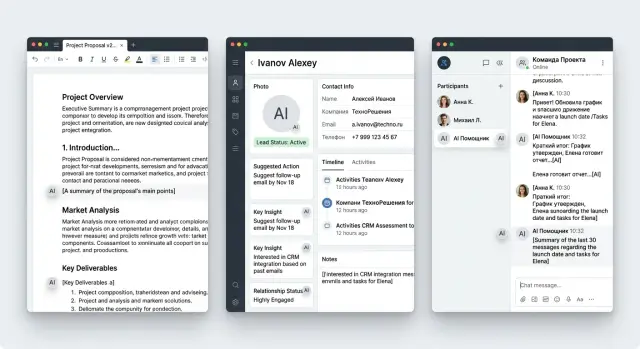
How to show the label in CRM
In CRM, decisions are made fast: who to call back, what to send, what to record in the deal history. If the system mixes manager-written text with model-generated text, confusion starts almost immediately.
The label should sit where the person sees the result before acting, not in help text or a hidden menu. Its job is simple: remove the question, "Who wrote this text?"
In the lead card and event feed
In a lead card, it is convenient to mark the AI call summary right in the block heading. A short label like "Created by AI" is usually enough if the creation time is shown nearby. The manager immediately understands that this is a condensed summary of the conversation, not a manual note from a colleague.
If the summary can be edited, the label should stay after the edits too. Otherwise, a day later no one will remember where the model's original text ends and where the person rewrote everything. A note like "AI draft, edited by Marina" solves this problem without extra noise.
In the event feed, AI notes are best separated from manual comments not only by words, but also by the shape of the block. Manual entries can stay as regular comments, while model notes are shown more compactly, with the label in the first line. That makes the deal history easier to read.
Before sending and in the activity log
Before sending an email, the label should be right by the draft itself, next to the subject or above the text. If the manager sees "Draft created by AI", they have time to check the tone, numbers, and promises to the client before sending. In sales, this is especially important: one inaccurate condition often turns into a long investigation later.
A simple action next to it also works well: "Reviewed by a person." Not a separate window and not a long warning, just a short note before the send button. It does not slow work down, but it does make people look at the text again.
In the activity log, it is worth keeping not only the fact that the text was generated, but also the name of the person who approved it. A record like "Email created by AI, approved by Aсылбек, 14:32" helps people quickly understand how the message went out to the client and who took responsibility.
If the CRM is used by a bank, clinic, or telecom team, this kind of history makes internal review much easier. People do not need a complicated control screen. They need one clear answer in one place: the model suggested the text, and a specific employee sent it.
How to show the label in chat
In chat, a person looks at the latest reply and wants to decide quickly whether it can be sent on. That is why it is better to place the label by the assistant's reply itself, near the time, the bot name, or the action area. If you spread it across the whole conversation, the interface becomes noisy and the meaning gets lost.
For an internal draft, a short note under the reply is usually enough: "Generated by AI." It should not fight with the main action and it should not look like an error if there is no error.
The most important moment comes before sending the message externally. When the user clicks "Send to client", chat stops being a draft. Here, a small reminder right above the button or in the confirmation window helps: "Check facts, numbers, and tone before sending." The wording is calm, but useful. It pauses the user for a second, and that is often enough to remove an unnecessary promise or a wrong date.
Copying a reply needs a separate status. People often do this automatically: into an email, messenger, or customer card. If a note like "Needs review" sits next to the "Copy" button, the person sees the risk at the right moment, not after the mistake.
After manual editing, it is better to remove the warning color. Red or bright orange only makes sense for raw text. Once an employee has fixed the reply, the interface should feel calmer. For example, you can keep a gray badge saying "Created by AI, edited by a person." The origin stays visible, but the system no longer looks as if the text is still too dangerous to touch.
Usually chat only needs four touchpoints: a label next to the assistant's last reply, a reminder before "Send to client", a "Needs review" status for copying, and a more neutral label after manual editing. That is enough to keep chat fast without turning it into a wall of warnings.
How to roll this out step by step
First, make a short list of what your AI actually writes. Not "all content", but specific objects: a client email, a call note, a chat reply, a deal description, a draft article. Otherwise, the label quickly spreads through the interface and starts getting in the way where it is not useful.
Then introduce simple statuses. In most cases, three are enough: "Draft", "Reviewed", and "Sent". The user should understand them without training.
Each status is best tied to an action right away. "Draft" means the text can be edited, but it should not be sent without review. "Reviewed" means a person has already looked at the text and can use it further. "Sent" marks the moment the text went to the client, colleague, or CRM card.
If you make this explicit, the label stops being a sticker and starts helping with the work.
Minimal launch plan
Start with one flow and one team. For example, only outgoing emails in CRM or only support replies in chat. That makes it easier to see where people notice the label and where they ignore it.
A practical sequence is usually this:
- mark the places where AI creates text from scratch
- add the status next to the field, not on a separate screen
- tie one clear action to each status
- save status changes in the event log
After that, test three common scenarios. First: the user creates text with AI and immediately sees that it is a draft. Second: they edit a couple of sentences, and the interface suggests marking the text as reviewed. Third: they send the message, and the status changes to "Sent" without manual selection.
This is where the logic breaks most often. Either the send button becomes active too early, or the label does not change after edits, or the history does not show who approved the text.
If you work in Kazakhstan, it is useful to align the status names with internal labeling rules and audit logs right away. Then the interface, action log, and internal checks will all speak the same language.
Once one team goes through this process without confusion for at least a week, move the scheme into the editor, CRM, and chat. Not before that. On a small launch, mistakes are cheaper, and users are more honest about what annoys them.
Sales team scenario
A manager returns to a lead one minute after the call. The CRM already has an AI summary of the conversation, but it does not hide it among regular notes. Above the block there is a short label, "Summary created by AI", with the time and source nearby: "from the 12:40 call recording." The manager immediately understands this is a draft, not a finished fact.
Below, the system shows several fields: customer need, deadline, budget, next step. The CRM marks two questionable points gently, without warning colors. For example: "deadline recognized with low confidence" or "request for a quote may refer to the demo." The person immediately sees where the text needs a manual check.
In this scenario, labeling helps instead of getting in the way. It does not cover the screen, it does not ask for agreement at every step, and it does not force people to read long warnings. It simply tells the truth about where the text came from and how much trust it deserves.
The manager edits two fields right in the card. They change the deadline from "by the end of the month" to "discuss on Thursday", remove the incorrect budget mention, and set the status to "Waiting for email." It takes less than a minute because the CRM does not open extra windows or interrupt the rhythm after the call.
Then they click "Send email." The email draft can also be assembled by AI, but the interface stays calm: it shows the label "Draft created by AI" above the text, keeps the client and deal fields as regular CRM data, and lets the user send the email from the same screen.
That is how labeling works in two places at once. First, it separates the machine-generated summary from the manager's notes. Then it helps check the email before sending without breaking the usual workflow.
Without the label, the manager either trusts the summary blindly or copies everything into notes manually. Both options are bad. A good label answers three questions in one second: who created the text, what it is based on, and where it can be fixed right away.
Mistakes that frustrate users
The worst label is the one that gets in the way of the task. If a bright banner covers the input field, save buttons, or the last lines of text, people stop thinking about transparency and start thinking about how to remove the obstacle and finish the task.
That is how even good ideas fail. The team wants to show the model's involvement honestly, but does it too loudly. In the end, the label competes with the main scenario: write, reply, review, send.
Another common mistake is putting the label absolutely everywhere. The user opens a customer card and sees a gray "AI" tag next to a manager note, an old comment, a manual email, and a field where the model was never used. After a day, people stop noticing such labels. After a week, they stop trusting them.
An identical gray text with no meaning also works badly. If the editor and chat always show the same thing, people do not understand the difference between "AI created the whole text", "AI suggested a draft", and "AI helped rewrite two paragraphs." The label should answer one simple question: what exactly did the system do.
A status that does not change after editing is more confusing than no label at all. Imagine this: a manager took an AI draft of an email, rewrote half of it manually, added price and deadlines, and the old status is still there. Then it is no longer clear what to trust: the screen or your own actions.
Frustration usually starts in five cases:
- the label covers content or buttons
- the label appears where AI was not involved
- the label text is too vague and explains nothing
- the status does not update after manual editing
- the system asks for confirmation at every step
The last point is often underestimated. If the editor asks you to confirm insertion separately, then mark AI involvement separately, then agree to a warning separately, and then confirm sending once more, people start working around the feature. They copy the text into an external document, edit it there, and come back.
A good label is almost invisible until it is needed. But at the moment of doubt, it quickly answers where the text came from, whether it can be trusted, and what changed after editing.
Quick check before launch
Before release, it helps to do a short clarity test instead of a large design audit. Good labeling is noticeable almost immediately, understandable without instructions, and does not interrupt the pace of work.
The easiest way to check is to show the screen to a colleague for one second. If they can then answer two questions, you are in good shape: "Did AI or a person write this?" and "What should I do next?" If the person squints, looks for tiny text, or confuses the label with a task status, it needs to be redone.
Mini checklist before launch
- The label is readable right away. At a normal zoom level and on a phone, both the color and short text like "Created by AI" or "Review" are visible.
- The label does not interfere with the action. It does not cover the "Send" button, break the input field, or steal all the attention.
- The meaning is clear without training. The user should not have to guess whether the label means a draft, a hint, or autofill.
- Edit history opens in one click. The person can see what AI changed, what the employee fixed, and which version moved forward.
- The next step is visible immediately. There is a clear action nearby: "Review", "Accept", "Fix", or "Send after review".
After that, run three short scenarios. In the editor, the author inserts a paragraph and immediately understands whether it needs manual review. In CRM, the manager opens the customer card and sees that the comment was generated automatically, so it should be skimmed before sending. In chat, the operator reads the bot's reply and, without extra clicks, decides whether to send it as is, rewrite it, or take over the conversation.
If the person pauses for more than a couple of seconds in even one scenario, the problem is usually not the user. More often it is a tiny badge, an unclear color, or text that is trying too hard to be smart. A short and calm label almost always works better than a noticeable but confusing banner.
What to do next
Do not roll out labeling everywhere at once. Pick one screen where a mistake costs the most. Usually that is the place where a person can send, save, or publish text without a second check.
A good start is a screen where AI provides a draft and the employee makes a quick decision. For example, the reply field in support chat or a customer card in CRM with a ready-made call summary. If people do not notice the label there, they are more likely to take the draft for the final text.
Then look not at vague "like it or not", but at clear signals: how often the tooltip next to the label is opened, how many AI texts are edited before sending, how often employees cancel the action at the last moment, and how many errors are tied to unclear text origin.
After the first check, move the same scheme into other places. If the label worked on one screen, do not change it beyond recognition in the editor, CRM, and chat. The same color, the same wording, and the same behavior reduce unnecessary questions.
The order is simple: first test the riskiest screen, then adjust the label text, placement, and timing, and only after that scale the solution to other scenarios. Otherwise, you will multiply a weak pattern across several products at once.
If you have several AI features and different teams, it is useful to put the rules into one short scheme: where the label appears, when it disappears, what the user sees after manual editing, and what gets written to the audit log. It is not the most exciting work, but it saves many hours of arguments between product, design, and legal teams.
When the task depends not only on the interface but also on infrastructure, it is worth looking more broadly. If you need a single LLM gateway with audit logs, PII masking, and data storage in Kazakhstan, AI Router on airouter.kz helps you build these scenarios without changing your SDK, code, or familiar prompts. That is especially useful when you move the same labeling logic between the editor, CRM, and chat instead of building three separate solutions.
Frequently asked questions
Why label AI text at all?
Because without it, people start guessing. They no longer know what was written by them, what is a model draft, and what has already been checked by a colleague. As a result, they either reread everything too much or send an unverified version.
Where is the best place to put the label in an editor?
Place the label next to the point where the person decides what to do next. In an editor, that is usually the block title, a status line, or the area near the generation buttons, not the paragraph itself.
What should the label communicate at a glance?
Write it plainly and without mystery: Draft created by AI, Reviewed, Ready to send. Icons without words are often read in different ways, while a short phrase removes the question right away.
What should happen to the label after manual editing?
Update the status right after the edit. If a person has noticeably rewritten the text, it is more honest to show AI + editor or add the employee’s name and time so the next person sees the real picture.
Can the same label work for CRM and chat?
No, one version rarely works for every screen. In CRM, a short line next to an email draft or AI summary works better, while in chat a compact note next to the last reply and a reminder before sending fit better.
Where should the status appear before sending an email to a client?
Show it next to the email subject, above the text, or right by the send button. The manager should see where the draft came from before clicking, not hunt for it in a log or hidden menu.
How do you avoid overwhelming chat with warnings?
Keep the labeling short and show it only at the right moments. In chat, a label next to the reply, a Needs review status for copying, and a calm reminder before sending outside are usually enough.
Which statuses should we use at launch?
For a start, three states are usually enough: Draft, Reviewed, and Sent. If each status is tied to a clear action, people adapt faster and make fewer mistakes.
How can we quickly check whether the labeling is clear?
Show the screen to a colleague for a second and ask two questions: who wrote the text and what should happen next. If they answer without hesitation, the setup works; if they squint and look for a tiny badge, the label should be simplified.
What should be written in the action log?
Store not only the fact that the text was generated, but also the name of the person who reviewed or sent it. This kind of record helps you quickly resolve disputes, understand the chain of actions, and connect the interface with the audit log.